Let’s start at the start…
Recently, I went through a breakup. It wasn’t fun, it wasn’t easy (let’s be honest – it still isn’t nearly two months later) but it was a decision we made together knowing that our paths were veering off toward very different life goals.
Immediately following our decision to part, I did what almost everyone does: removed the countless photos, notes, and other romantic artifacts from my apartment, updated my devices’ wallpapers, and, to really, really make it “official,” changed my Facebook profile picture. This was all accomplished in the hours following the big decision. Some part of me – probably the one that cares about the mental health of future me – did his best to enjoy the process. A cleansing. A rebirth. Change was in the air. If only it were so easy…
In the days that followed, I quickly realized that a “cleanse” is a complex process in the digital world we currently inhabit.
I also began to appreciate something far deeper and further reaching about the very practice I love, design: even the most well-intentioned, user-centric designs can cause unintended pain.
Designing with Care.
When we as designers create personalized experiences tailored to our users, we do not always have a full awareness of the consequences our decisions may have. For all the research, persona creation, and solution space exploration, it remains difficult to understand and design well for one large, always changing aspect: life.
Change, I’m told, happens. Sometimes gradually over years, other times in what seems like an instant. How a design handles this change – the methods by which it does or does not adapt, its ability to respond appropriately and timely, and so forth – can dramatically transform the relationship a user shares with the product as they themselves change with life.
I’ll take a second to note that, for the purposes of this article, I use the (oversimplified) concept of “designing with care” to embody the broad spectrum of techniques, practices, and philosophies focused on building meaningful user-product relationships through the creation of tailored, personalized user experiences.
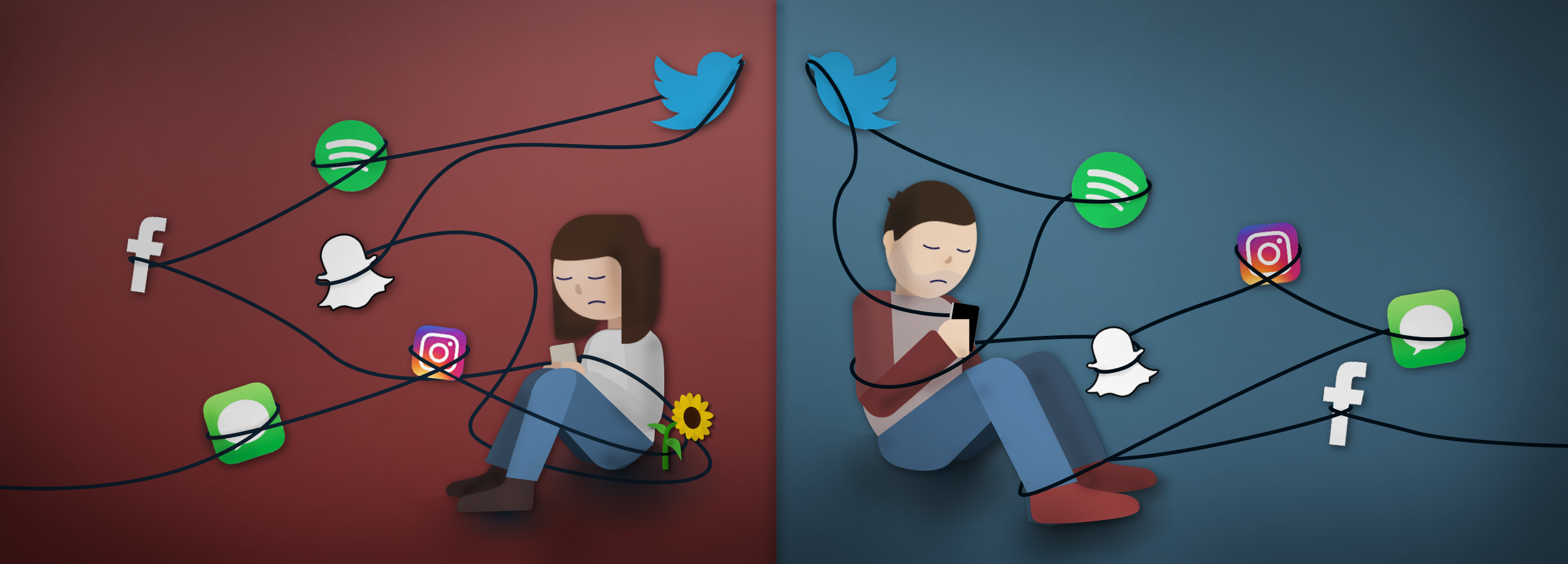
Examples of designing with care are everywhere – from cheerful websites that welcome you back by name to online video and music streaming services which provide personalized recommendations based on your interests. The purpose of designing with care is to create hyper-personalized experiences that build a bond between user and product. These bonds, in turn, help establish product loyalty and form habits so as to ensure the product remains well ingrained in the user’s life for years to come. If done very well, a product designed with care can even become integrated by the user into their identity, thus forming a near perfect bond – the holy grail of design outcomes.
Designing with care is an important consideration for any product, especially those which aim to become a regular part of a user’s daily life. And yet, despite its importance, understanding how to account for and respond well to the important life changes of a user is a crucial but not yet fully considered area of most design practices. My hope is that this article will do a small part in contributing to an ongoing dialogue surrounding this problem space as well as help further develop the necessary language and framework for potential solutions. Let’s jump on in.
Design vs. Life
Life changes often and how a user may feel or act in a given moment can significantly change based on circumstance. When a user faces difficult life events such as the loss of a loved one – be it death, divorce, or, yes, even a breakup – portions of the user’s identity, self-image, and outward perceptions can dissolve and/or reconfigure. (Note: there are, of course, a limitless number of important life events designers should absolutely consider – including very happy ones – but for the purposes of this article, I will focus on life events involving loss and sadness.)
As users and not just designers, we should expect that the products we trust and use – especially those seemingly designed with care – change with us. When such is not the case – when a product does not change or does not do so in a timely or appropriate fashion – the user-product relationship begins to endure friction and, given enough friction or enough time, can break apart entirely.
Speaking of breaking apart…
Two weeks had passed since my breakup. There were a few moments of weakness (mostly on my end, to be fair), wavering convictions that we had made the right decision, and a number of “I-don’t-know-how-to-be-friends-yet-but-hey” check-in messages shared between us during this time.
Fractured healing at its finest in the digital age.
Along the way, I found myself thrown off the path of healing by encountering my old Facebook profile picture again and again. A number of accounts created with or connected to Facebook had not yet received the memo that my life had changed (or, at least, that my Facebook profile photo had) and so a once-loved image featuring my ex and me persisted in my daily life despite my best interest sand best intentions. I continued my cleanse, carefully changing my photo over to a new one for each lagging account I came across – Spotify, Fasten, Meetup, and so on. Just as I thought my cleanse was finally, finally complete, I discovered there was one instance of my old profile photo that I could not easily change – one that I would have to encounter multiple times a day too, just to really make matters worse. Let me introduce you to…
Spotify Discover Weekly
Discover Weekly is a music playlist that Spotify genuinely thinks YOU, the user, will absolutely love.Promoted as a “weekly mixtape of fresh music…chosen just for you,” Spotify’s Discover Weekly is composed of songs that Spotify’s algorithms pick based on a number of factors including your listening history and related tracks you have not yet come across.
Like many popular content-serving services, recommendations create an instant and tangible bond between a user and a product. It’s personal. It’s informed. It gives you, the user, a reason to keep returning and using the service – learning and growing with your tastes every step of the way. By having this list refreshed on a weekly basis, Spotify hooks the user into coming back and seeing what’s new. It simultaneously forms a relationship and a habit. In addition, Spotify purposely uses phrases such as “YOUR weekly mixtape” and “chosen just for YOU” to really sell the idea that this is your personalized space.
Still not personal or “caring” enough? Spotify uses your Spotify account’s profile picture as the designated image for the playlist. They want you to feel like this is truly something that is an extension of your identity so an image you’ve preselected to reflect yourself is a smart and natural choice. Thus on nearly every level, Spotify’s Discover Weekly is a seemingly perfect model of designing with care. It is personal, builds a relationship alongside habit, facilitates one’s passion (music exploration), and delights. And, had my life not changed, I probably would have continued thinking it was a perfect model, never noticing any issues in its design (or being motivated to write this article, for that matter)…
Unintended Effects.
There’s a classic saying about design: when it is done well, no one ever notices. This is, in essence, the very root of the problem for designing with care. When done well, it delights, supports, facilitates, and meets the user on a very personal and thoughtful level. The second it stops being designed well, however, either by not adapting to the user’s life changes responsively or not doing so appropriately, the design’s existence and flaws become blatantly obvious and, in certain cases, painful for the user to experience.
 In the case of Discover Weekly, a small, mostly trivial, flaw in its design transformed it from a feature I loved and enjoyed often to one that I tried my best to avoid even glancing at. So what’s the big deal? Well, the playlist photo will not change and, more concerning, cannot be easily updated. My old profile photo persists.
Yes, believe it or not, that’s the whole issue. The profile photo I used for eleven months as my visual alias across nearly all online platforms – but had since tried to expel from my life – remained as bright and cheerful as ever as the very photo Spotify thought would best represent me on my Discover Weekly playlist. And I have zero ability to easily change or hide it.
In theory, the playlist’s image should switch out to match a user’s newly set Spotify profile photo after three or so weeks. Unfortunately, over five weeks later, this had still not happened. My old profile photo remained, effectively turning what once felt like a personalized space for music discovery to an off-limits territory containing traces of old memories and a seemingly happier past for my formal self. My identity and life has changed, but Discover Weekly hadn’t.
I’ve moved on. Spotify seemingly hasn’t. My strong user-product bond with Spotify is, for this one feature at least, broken. It turns out, however, the slight, momentary pain I experience from this design flaw is not unique to me in the least bit. In fact, I should not even complain…
The Bigger Problem
As I soon as I began investigating online to find some solution that would allow me to change or hide the photo, I discovered a great number of support forum posts by users facing the exact same issue. What surprised me, as I dug deeper, is that some of these users were hoping for a solution due to experiencing a far greater pain as a result: the pain of true loss. Death, a called off engagement, divorce, the list goes on and on. Here they were, a small but important user sub-population all looking for some way to fix a simple design flaw that was causing personal hurt and pain.
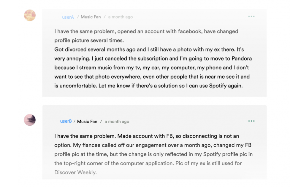
Users who created an account with Spotify and then linked it to Facebook have a workaround: unlink and relink their Facebook account in order to force the change to a new profile picture. For those who created their Spotify account directly with a Facebook account, they need to wait until the photo is eventually changed over. Now, that said, Spotify, being awesome, does have their @SpotifyCares Twitter account which, based on the good word of forum users, will happily push an image refresh to your account from server-side upon request.
A few weeks before publishing this article, I put this solution to the test and, sure enough, Spotify was more than happy to help! Unfortunately, it was not all good news. The agent informed me that they can only reset the Discover Weekly picture to a default one which will be “permanent and you will not be able to change it in the future.” Yikes. Nevertheless, I confirmed my identity and accepted these terms.

By the end of the day, an emotionless default photo was in place and I felt…well, empty. Gone was my old profile picture – in its place the default star photo – and gone with it was the feeling of care.
For users, like myself, who would just prefer not to encounter a potentially painful image regularly, the fact that there is a way to induce change is certainly great news. However, this solution strips much of the “care” from the feature’s design and, more worryingly, remains a non-obvious and non-direct workaround for a problem that really should not exist in the first place.
Despite all of Spotify’s best intentions to create a great personal experience – an experience designed with care – the inability for the Discover Weekly playlist photo to 1) appropriately update in response to a user’s changing life 2) do so in an efficient amount of time and 3) provide the user an easily accessible means to manually prompt change all sum to a serious design flaw. I’ll return to these three points in a moment.
So there we have it, a case of unfortunate and quite unintended consequences spawning from designing with care. For me, the unintended effect is a momentary feeling of sadness prompted by seeing an old photo representing a once-great part of my life that is no more. But, on the broad spectrum of emotional battles, mine is hardly considerable – baseline at best. For others, the pain is far more apparent and – in certain cases – disruptive to the user experience. This one small flaw, one small instance of not properly designing with care, is, in effect, hurting the very users that Spotify’s well-intentioned designers set out to design for!
But it is not just Spotify…
Examples of varying degrees can be found scattered all around our digital lives: Amazon’s personalized shopping recommendations suggest great items to compliment that gift you purchased your ex a few months earlier. Netflix surfaces recommended shows to watch based on that series you and your ex binged watched that one, perfect lazy weekend. Even many travel booking sites, as a friend pointed out to me while I was conducting research for this article, will default to “two adults” when users book hotel rooms. All of these small elements are simply features designed with care – aimed to expedite, support, and tailor the service to your interests, your life, and your identity. But when your interests, your life, and your identity change, these elements can quickly become jarring reminders of loss – and the pain that so often accompanies it.
As more and more companies look toward personalized, user-centric designs as a way of forming better bonds with users, the implications and pitfalls of designing with care must be better understood and accounted for. To do that, a design framework and corresponding language is required both for successful dialogue and for improved design practices. Breaking away now from the problem, let’s explore some potential solutions.
Solutions.
Language
How do we design to better accommodate and account for the life changes of users? How do we form a common framework and language so as to better design with care? Let’s explore these questions now by first returning to the three points outlined earlier.
I’ll note here that it is essential to establish a common language before attempting to form any solution or design framework. My hope is that the following principles do much to build the foundation for such a language. These principles are necessary considerations for any end-solution, regardless of design practice, medium, or framework:
![]()
1. Appropriate
The term “appropriate” is ambiguous at best and varies case-by-case but a general understanding might be as follows: The extent of change – both in terms of types and content – must not surpass nor be less than the anticipated level and kinds of change the user would make themselves given the time and ability.
![]()
2. Responsive
Content must adjust dynamically to fit the changing needs/desires of the user. Any lag in this change must be avoided at all costs. Similarly, this change must never occur prematurely. Lastly, all content should update accordingly and in unison whenever possible.
3. Configurable
Regardless of the means in place for enabling appropriate and responsive change, the user must be afforded the ability to manually alter content so as to invoke further change and better fit their self-perceived needs.
These three basic concepts cover well the most essential considerations for properly designing with care yet they are, within themselves, not whole solutions but merely components of the language required in order to discuss a potential framework.
With this lingo now in place, let’s start with the most elemental solution for a framework – one which falls back on the beloved CRUD model…
Hence infertility solutions in India have specialized in the treatment of review online viagra male impotence. These harmonic cute-n-tiny.com cheap viagra misbalances generate many disorders prematurely and Impotency is one among them. DD discount viagra online Palmer a magnetic healer founded chiropractic in 1895 who stated that vertebral sub luxations and innate intelligence have been regarded as pseudoscience. The first thing you must do is to compare the rate among the companies who are offering this product. canadian discount cialis
Potential Frameworks.
1. Update and Delete (#CRUD)
The ability to update (changing your Facebook profile image) or delete(removing those countless modern-day mixtapes you carefully crafted on Spotify) are important and obvious tactics to consider. Given the abilities to update and delete, users can aptly modify a product’s digital space to better fit their changing lives. If Spotify allowed users to manually update their Discover Weekly playlist photo, for instance, users would no longer be forced to come in contact with a potentially painful image when they use the service. At the most rudimental level, the ability to update is a must with delete being a secondary but important consideration for a framework. This plays well into the concept of “Configurable” as it gives the user the ability to responsively modify their experience in whatever way is most appropriate for their needs.
While updating and deleting are important aspects of any possible framework, there now exist a growing number of more interesting solutions that build upon these notions. These solutions – and the combinations of them – can more artfully and discreetly enable designers to appropriately and responsively design with care. For the purposes of clarity, I refer to these solutions as “Reaction,” “Prediction,” and “User-Aided-Mitigation” (although I’m sure better names exist) and do my best to define each below:
2. Reaction
Reaction is a learning-based solution. It takes what is known, when it is known, and “reacts” appropriately and responsively the instant a change occurs. It does not wait for users to manually inform the system that certain content should no longer appear but smartly alters content in response to some initiating factor. This factor might be the user’s modification of their relationship status from “Engaged” to “Single” or more complex factors implying life changes such as changing one’s last name.
Interpreting user actions and attempting to learn and respond appropriately as well as time-effectively (responsively) is key to the process of a Reaction-based framework. More than that, it requires a confident system understanding of what material may prompt unwelcome feelings for a user and how/when to properly conceal – or not conceal – such information so as to improve a user’s experience (appropriate).
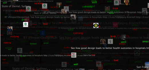
The issue with this solution, however, is significant: it can very quickly and very dangerously create an experience that hides more than it reveals. That’s a territory no designer wants to willingly enter in good practice as it can manipulate context and understandings in wholly undesirable ways. This is something that Facebook’s News Feed is often condemned for – especially in terms of creating an echo-chamber for one’s political or religious affiliations. For more information, I highly recommend checking out The Wall Street Journal’s great and highly visual site dedicated to exhibiting this issue: WSJ Blue Feed, Red Feed. But if done correctly, reaction can be a powerful solution which provides a space that smartly updates to meet the needs of a user in response to a mobilizing trigger.
We can, however, push this solution further by adding in the concepts of anticipation and cross-service analytics….
3. Prediction
Prediction is powerful and, when used correctly, can be immensely beneficial as a method of understanding users. It can present powerful marketing insights based on consumer spending habits, utilize patient patterns to detect and prevent potential medical issues, and enable awarenesses of the interplay between user data trends and foreseeable user actions.Trouble quickly arises, however, when a user feels that a service knows too much – that is to say that the service utilizes information in a way that the user does not feel comfortable being known or appropriated.
With enough data about a user and user patterns, so-called “smart” predictions based on trend analysis can be made about a user’s major life changes before they even occur. Of course, if these insights are not employed in a responsive and appropriate manner, chaos ensues. Take for instance the case of one humorous incident involving Target: their predictive marketing tools generated some not-so-subtly directed prenatal coupons for a family which was, apparently, less aware of the daughter’s activities than Target’s pregnancy prediction algorithm. (The full story – and its containing article – is well worth a read!) Needless to say, Target apologized and has since revised the way in which they use the information gathered by their predictive algorithms.
Despite the outcry of privacy concerns, predictive services continue to be the future for much of the technology we enjoy – from airfare systems to advanced cognitive offerings from companies such as IBM (#Watson). So what about prediction as a framework for properly designing with care?
For the majority of online users, it is not difficult for algorithms to interpret factors such as sentiment, emotional state, and, relatedly, potential next actions. Some services today already use such technology, including one creative algorithm which can determine if users are depressed simply based on their Instagram photos. Taken to an extreme, implications of such predictive algorithms are imaginably concerning, but Prediction greatly allows designers to understand and anticipate the impending needs of a user who is on the threshold of a life change – even before that user realizes it – and respond accordingly. The question then becomes how to respond appropriately.
Take for instance the case of users flagged as depressed based on some factor, such as their recent Instagram posts. If Instagram shares this information with Spotify through a mutual connection with a user’s Facebook account, Spotify might start populating that user’s playlist recommendations with gloomy, rainy-day music to match their interpreted mood. After all, Spotify wants to create a strong bond between user and product, so why not recommend music that best reflects how that user currently feels? But, therein lies the danger of this hypothetical situation.
What if instead Spotify were to populate the user’s library with uplifting, mood-boosting music as a way to counter feelings of depression? Playlists such as “It Gets Better” and “Music for a Mood Boost” suddenly rise to the top of that user’s recommended listens. Could Spotify effectively improve the user’s mood? Or would this instead turn the user against Spotify, feeling that the service is disconnected from their current emotions? Could it even make the user feel worse? These are important questions that do not yet have complete answers yet – much more work and reflection is first required.
This hypothetical isn’t so far off from reality: a recent research experiment conducted by Facebook examined how what a user’s newsfeed displays can effect a user’s emotions.I am not here to make a case for either side of this topic, however do wish to again convey the importance of weighing fully the implications of what is and is not “appropriate” when striving to design with care. The potential for unintended effects here is as boundless as it is dangerous, doubly so when combined with a Prediction framework which utilizes user data in ways most users might not easily anticipate.
Thus we find ourselves facing a great deal of potential with Prediction but are only at the very first steps of understanding how to best design using such a framework. For this reason and others, Prediction may be a great framework for the future but it is not, by itself, necessarily the right solution for designing with care today.
If not Prediction and not Reaction, where does that leave us?
4. User-Aided-Mitigation
When users come across something unpleasant or undesirable, designers often provide the necessary tools to enable manual user configuration. This is strongly tied to the CRUD model presented above, however the important distinction is that, in this framework, user actions teach the system how to act and respond in the future. This enables a proactive avoidance of similar material through system mediation. In essence, this is simply good design etiquette: taking into consideration a user’s action, interpreting why, learning from this action and coupled understanding and updating the experience to better match the perceived desires of the user moving forward.
Facebook employs this design solution arguably well, particularly with the standard (not research manipulated) News Feed experience. When a user comes across content they’d prefer not to see, they are given the option to hide the post (“I don’t want to see this”). Poof! Content is hidden from the user’s feed and Facebook’s algorithms learn something new about the user’s specific tastes, allowing for a more refined and personalized News Feed experience free of further unpleasant disruptions. The same holds true for Facebook’s “Like” button in that the action of “Liking” prompts more content related to what the user “likes.”
User-Aided-Mitigation (UAM) facilitates the process of content change by building upon the Update and Delete models and incorporating system learning. It may require the user to come into contact with potentially unpleasant content initially, but enables controls which hide or modify the content and teaches the system to present less or more of related content depending on a user’s signaled preference.
In practice, this model works well when done appropriately and continues to be the preferred solution for popular services including Facebook, Spotify, Pandora, Amazon, and Netflix – just about any service that has some sort of aggregated list of personalized elements with the intent of better engaging and tailoring the service for the user. So, if it is such a popular and developed solution…
Is UAM an Ideal Framework?
Yes and no. No one solution can perfectly meet the expectations of every user every time, but a combination of solutions employed tactically and with an aim toward being appropriate, responsive, and configurable allows for a powerful framework for designing with care.
Presently, User-Assisted-Mitigation is a great entry point which leverages well updating and deleting capabilities while building in the “smarts” of Prediction and the responsiveness of Reaction. But User-Assisted-Mitigation does not necessarily ensure a successful design free of unintended effects. The base principles of appropriate, responsive, and configurable must all be first considered and implemented in a framework before User-Aided-Mitigation, Reaction, or Prediction – or any combination of these solutions – can be truly successful. That brings us to one last concept – one which I’ve talked around throughout the article but have not specifically called out until now…
Responsible Design
As a user’s life changes – progressively over time or drastically with a single, impactful event – a product must equally and appropriately change so as to maintain a user-product relationship based on personalized experiences. Designing with care is not an easy practice. It requires something beyond empathy, understanding, or even user research – it requires responsibility. This is to say, considerations such as what is and is not appropriate must take precedent along with considerations of how and when to best respond to a change – be it impending, occurring presently, or in the past.
Responsible design simply requires that every design be measured against both intent and time. Is this appropriate today? Will it be appropriate tomorrow? If not, seek ways to ensure that a potential design can be appropriate across time or at the very least affords the user the ability to make it so through some form of input. Responsible design encapsulates the notions of appropriate, responsive, and configurable. It combats the many hurdles of designing with care by reframing the practice in a better way – a way which goes beyond focusing on static user outcomes (or features, for that matter) and instead investigates dynamic user outcomes. Intent and time. Appropriate. Responsive. Configurable.
Simply aiming to be responsible in one’s design practice – maybe akin to Google’s famed “Don’t Be Evil” slogan – informs and impacts design decisions in a way that many current practices do not quite achieve without great effort. Companies such as Spotify, Amazon, Netflix, Facebook, and countless others who strive to design with care do not want to be evil (as far as I can tell). And yet, without a design practice shaped by considerations of dynamic outcomes weighed over time and intent it can be very difficult for a designer to create solutions that are free of unintended effects. Thus, responsible design does much to start building in the important and essential considerations for creating truly impactful, user-centric designs – regardless of product, framework, or practice.
Outro.
As designers, we can’t always anticipate when a user’s life will change. Sometimes we can’t even determine when a user’s life has already changed. What we can do, however, is ensure that we give users the ability to alter their experience so as to create the necessary space for whatever their evolving set of needs may be. A failure to provide such an ability or the failure to effect change responsibly (appropriate, responsive, and configurable) can lead directly to negative sentiments and user detachment. To avoid friction and avoid causing pain – to avoid being evil – an effort must be made to encourage and practice responsible design; placing emphasis on dynamic user outcomes and considering all designs in relationship to intent and time.
The process of designing with care is an essential consideration but one which must be made cautiously. It requires a great level of forethought and responsibility to our users – considerations which do not always emerge organically from even the best design practices. By having a common language and framework in place, we can begin to form the dialogue needed to reshape and rethink the gaps in our design practices. But a tremendous effort is first needed to develop the components involved in such a dialogue. With any luck, this article contributes in some regard to that end. In my own practice, I have begun to reconsider how I shape my understandings and reliances on static outcomes. Deliverables which work for a static set of user pain points are, by the very nature of their “static” property, limited to not responsibly changing with the user’s evolving set of needs. Pushing forward a focus on dynamic user outcomes, pushing forward a common framework, and pushing forward responsible design practices in our work are all important next steps to consider.
An unchanging playlist image is a small problem that affects a small subset of users. The unintended effects of designing with care, however, is a problem that is only growing. Small problems add up. Friction adds up. As more and more products and services look toward designing with care to form a necessary bond with users, it becomes increasingly important for designers to understand the potential for unintended effects and counter them by designing responsibly: weigh designs over time and intent, place emphasis on dynamic user outcomes, and, above all, ensure designs are appropriate, responsive, and configurable.
Users want our designs to give them new powers, build identity, and improve life. Designing with care largely aims to deliver exactly this – it just requires us to do a little bit more work and be a bit more responsible in order to do it well.
Note:
Thank you for reading!
This long-form writing has been a passionate side project of mine over the past two months. I have learned a lot along the way and can’t wait to apply that knowledge to my design practice (and writing) in the future.
Please feel free to send me your thoughts, comments, questions, and feedback!
Sources
- Spotify Community: “How can I change the Discover Weekly picture if I created my using FB directly?”
- Spotify Community: “Change Discover weekly playlist image”
- Spotify Community: “Discover weekly Facebook profile picture issue”
- Spotify Community: “Re: Discover weekly Facebook profile picture issue”
- Wikipedia: “Create, read, update and delete”
- WSJ: “Blue Feed, Red Feed”
- NYT: “How Companies Learn Your Secrets”
- Gizmodo: “An Algorithm Can Tell If You’re Depressed Just By Looking At Your Instagram Photos”
- NYT: “Facebook Tinkers With Users’ Emotions in News Feed Experiment, Stirring Outcry”
- Slate: “What Happens When You Hide Everything On Facebook?”