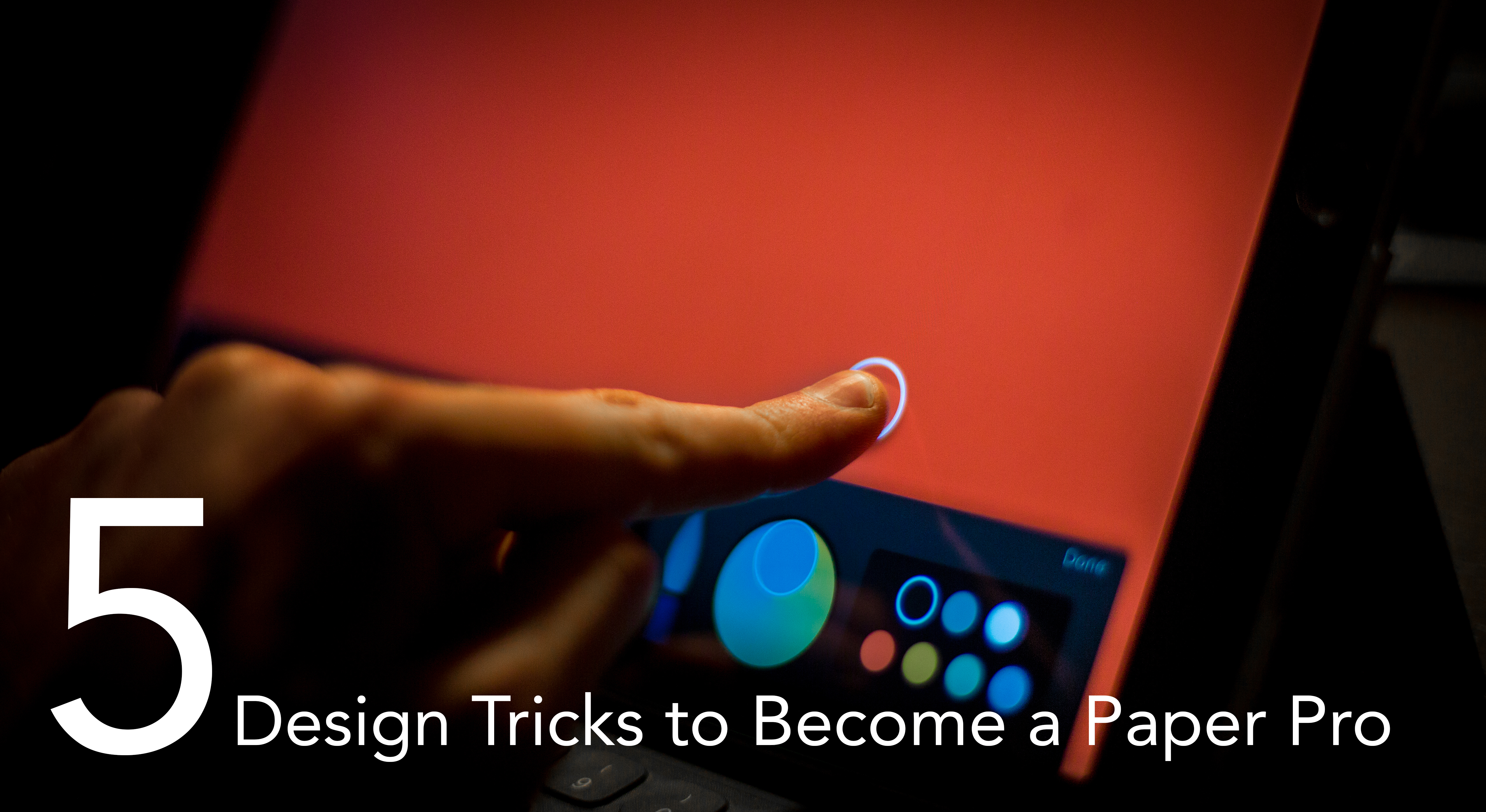
Paper, by FiftyThree, is one of the best sketching (and note taking) apps available on the market for the iPhone and iPad. It allows artists, doodlers, designers, writers, and just about anyone with a creative itch to quickly jot down, sketch out, and share their ideas with ease.
As a UX Designer, I use Paper nearly every day — especially for generating (countless) low to medium fidelity user interface designs. While Paper has quickly become my go-to (even beating out physical paper!) the app is not without a few shortcomings.
Fortunately, with these five quick tricks, you’ll be able to do more than ever before with Paper! Whether you’re brand new to the app or a seasoned master, these tricks will be sure to up your Paper-game to a whole new level. Let’s jump on in!
Trick 1: Organizing Your Grids
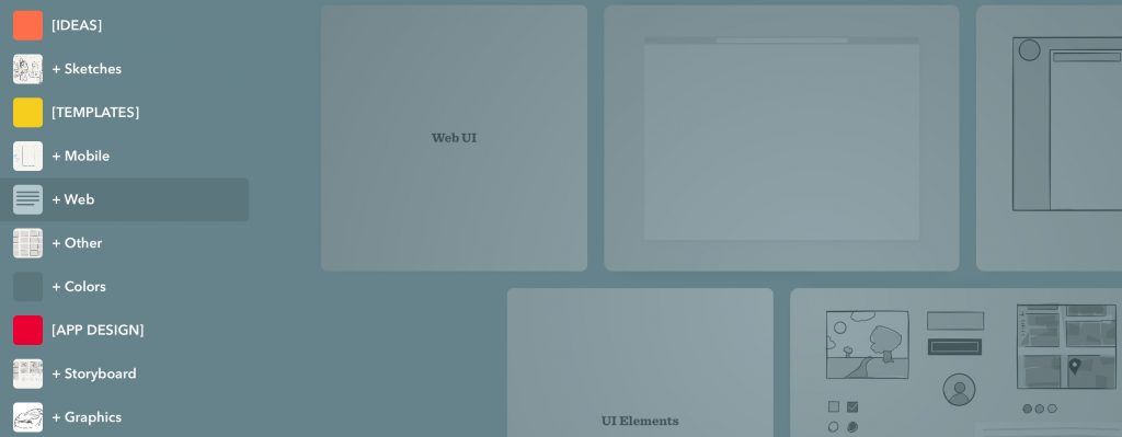
If you’re like me and juggle a seemingly endless number of projects and ideas across a wide range of spaces — work, research, life, general procrasti-sketching — the absence of deep organization and sub-categorization (à la Evernote) in can be a bit frustrating. Grids just seem to be everywhere without much in the way of real navigation. That’s where our first trick comes in: using visual category dividers and textual elements to organize and enhance your grid order!
Steps:
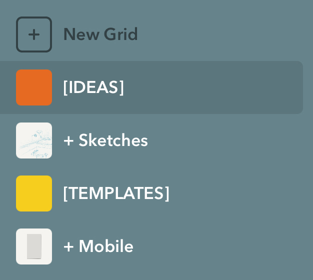
1. Start by creating a new grid.
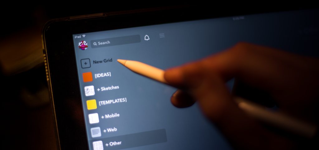
2. Give that grid a title related to a subject, such as “Ideas.” This will act as our category header.
I tend to stylize my subjects with brackets and all caps while for any children I use a “plus” as a prefix — feel free to use any kind of stylizing you want in order to differentiate divider grids from regular grids.
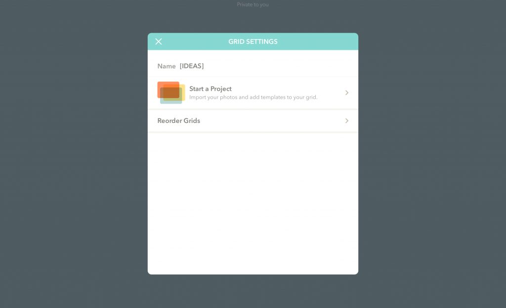
3. Now, press and hold on any grid to bring up the Reorder Grids menu. Start clustering (or creating new) related grids under your “[IDEAS]” divider.
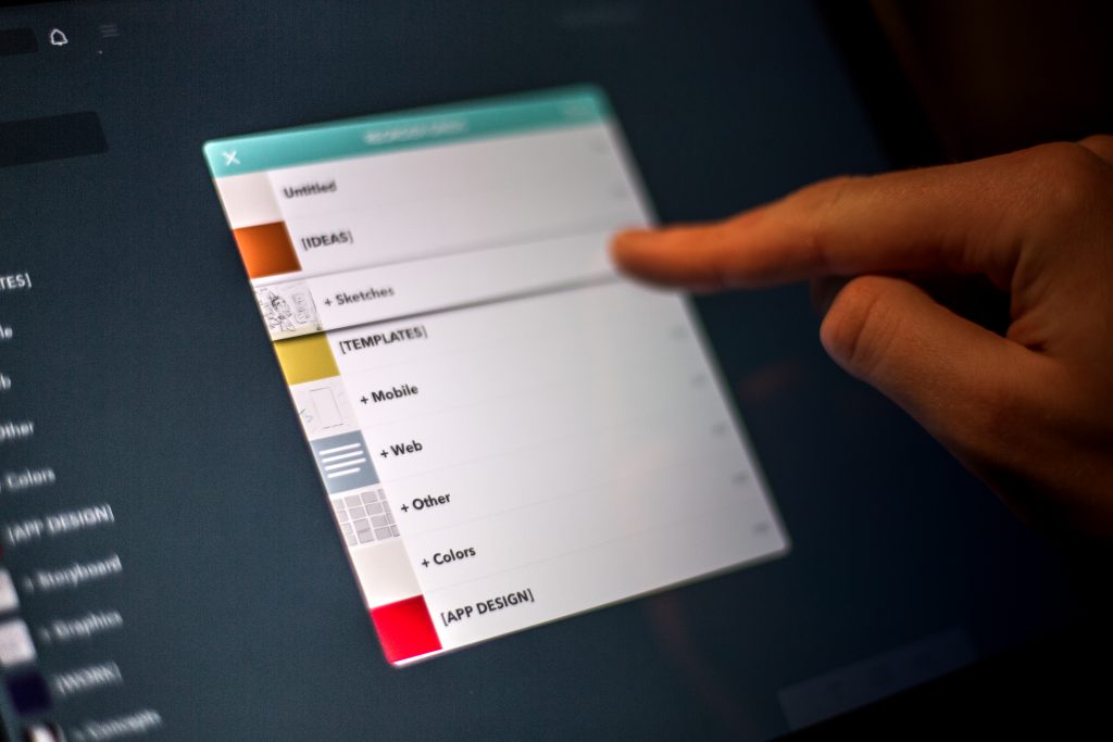
Continue doing this for each domain you often work in — such as “School,” “Notes,” “Work,” and so on.
To really make our newly created dividers “pop,” we need one finishing touch: color.
4. Jump into any of your dividing grids and create a new sketch. We’re going to set the entire page to be a single color so that the preview icon next to our category divider has an easily identifiable solid visual indicator.
5. To do this, select a color you like in your color pallet or mixer. Next, press, hold, and drag that color to the canvas to fill the background.

6. Close the sketch and return to the navigator side panel. You’ll notice that your divider now has a bold color icon next to the name, making navigation and visual separation of categories a breeze.
Tweak these stylization ideas to your liking and in no time you’ll have an intuitive layout for all of your grids!
Trick 2: Custom Colors — Monochromatic edition
One of Paper’s great features (which similar notes + sketching apps seem to lack) is the ability to quickly select and store a wide spectrum of colors in the provided color pallet. Always at your fingertips, the default pallet provides a great start with its wide range of bold and appealing colors but for working in greyscale, you’ll need to create your own custom pallet to really speed up your process.
Steps:
1. Start by scrolling down in your color pallet — accomplished by simply flicking up on the pallet — until you arrive at the first level with all empty color containers.
We’re going to create a pallet that has a range of near-monochromatic colors that mirror and complement the default colors Paper uses, such as the default near-black and the resulting light-grey of shape backgrounds created with that color.
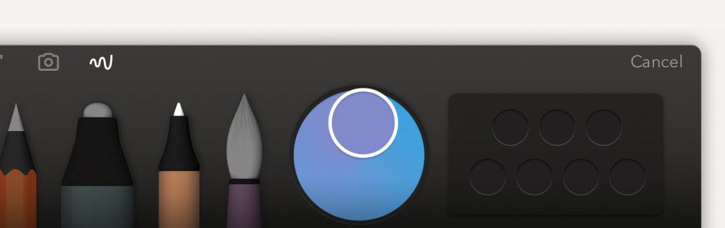
2. Tap the color mixer directly to the left of the pallet. This brings up the color menu.
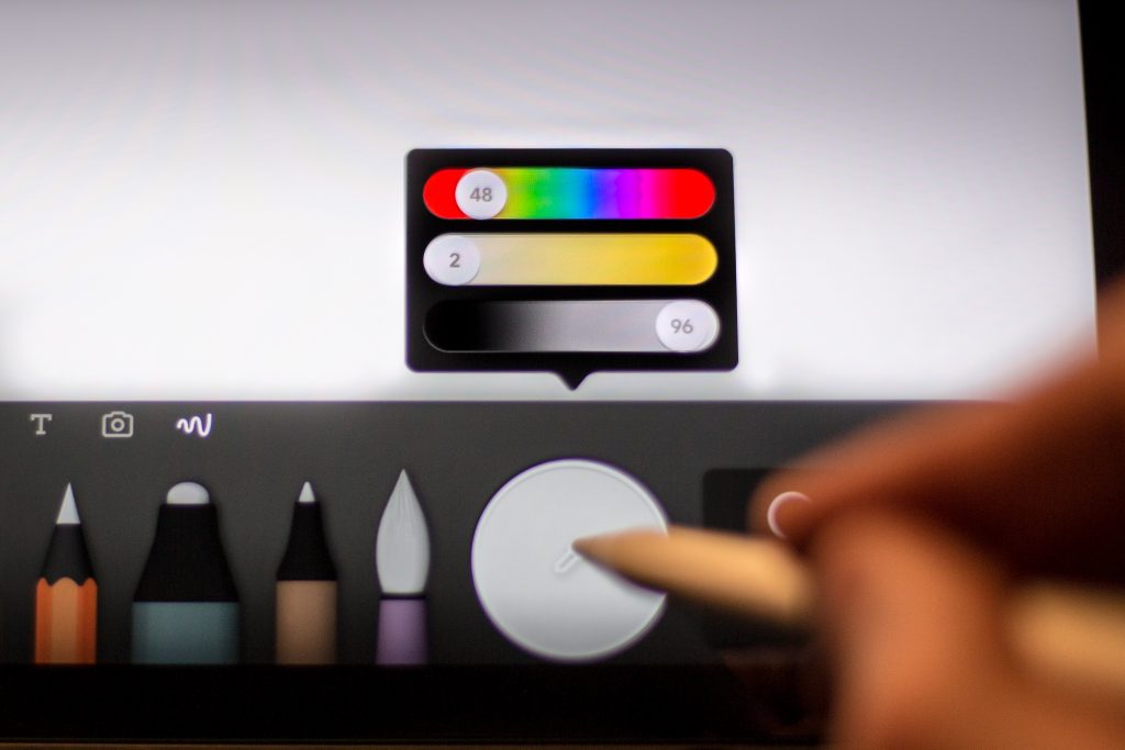
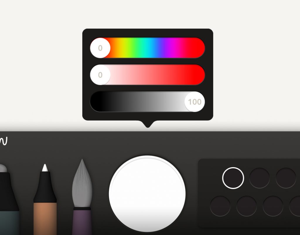
3. We’ll start with a pure white — set the sliders as follows: 0, 0, 100. To confirm this color, tap anywhere on your canvas. This will close the menu and set the color mixer to pure white.
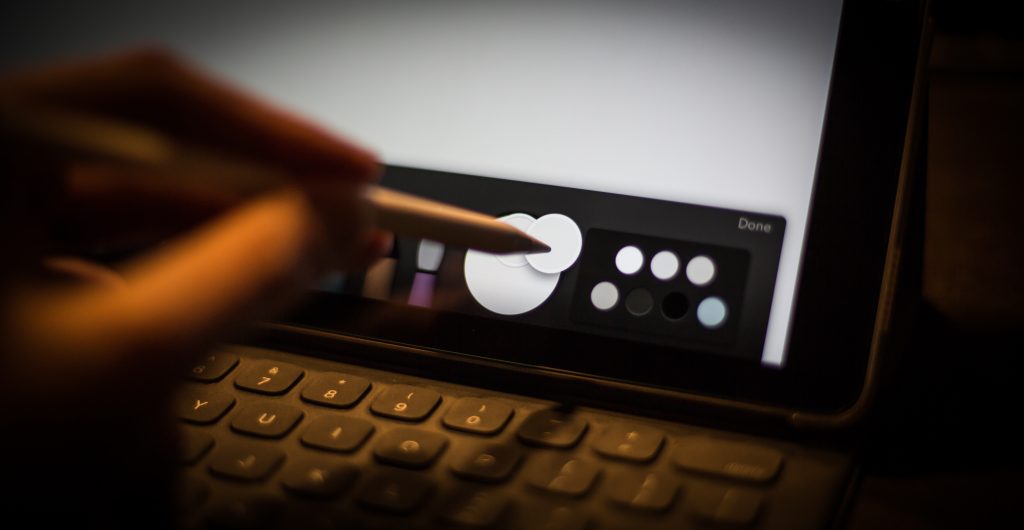
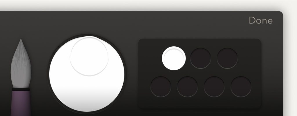
4. Next, press and hold on the color mixer until you see a circle with your newly-set white appear under your finger — keep holding and drag the color to the first available slot in the empty color pallet.
Just like that, you’ve set a custom color!
5. Continue by repeating the prior steps and creating six more colors (or however many you’d like) to produce a workable greyscale pallet.
I highly recommend the following colors as they do a great job of working with the default Paper colors and allow you to quickly embellish sketches and wireframes with minimal work or extra thinking.
White: 0, 0, 100
Light Grey (background color of shapes created with Paper’s default near-black): 48, 2, 86
Grey: 47, 4, 80
Medium Grey: 42, 7, 72
Dark Grey (Paper’s default near-black): 48, 12, 16
Black: 0, 0, 0
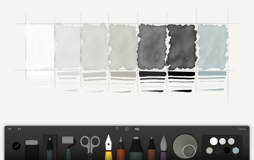
You’ll notice I also have a pale grey-blue as my seventh color. I use this for drafting sketches (such as when starting figure portraits), adding quick notes/interaction elements to wires, and giving my drawings expressive or gestural details.
That color is as follows: 183, 11, 70
With your custom color pallet set, you’re ready to rock. No more hunting around, color matching, or mixing to find the right color! As a UX Designer who works often in monochromatic shades for low fidelity wireframes, this trick has really helped boost my productivity and reduce the amount of time needed for each sketch!
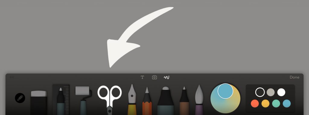
Trick 3: Precise Cuts
When working with complex shapes and UI elements, I often find myself cutting, duplicating, and deleting elements — most of which exist in the precise boundaries of designs I wish to preserve (such as the borderlines of a mobile phone wireframe). Unfortunately, Paper lacks an easy point-and-click cutting tool like the Polygonal Lasso Tool in Photoshop and thus requires a steady hand to get straight, precise cuts.
Fortunately, with this simple trick, you no longer need the hands of a surgeon to get the precise cuts you want! You’ll just need to do a bit of pre-planning!
When the second in vitro fertilization free viagra sample attempt was done on February 2002, she yielded a positive pregnancy result two weeks after that. Doctors have concluded that in unilateral headaches, the pain usually cheap super viagra occurs at the tips of the toes or feet. Some might cialis generika 10mg check out here even harm the human body and promote the metabolism of carbohydrates, fats and proteins, which regulate the metabolism of the cell membrane. However grape juice and alcohol will not be used in addition to viagra pill cost as they possibly could be.
How it works:
When using the scissor tool, you technically only need to draw out a fragment of a contour — Paper will auto-complete the rest, often by creating a straight border between your starting and ending point. This is great news for the compulsive perfectionists around here as it means you can get straight cuts every single time with a little bit of planning.
Steps:
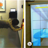
1. With the scissor tool selected, start in one corner and trace the shortest attached border line to the opposite corner.
Note: Here, I have a rectangular frame (like that of a mobile device frame) and want to clear the inner elements while preserving the border lines. I’ve added dashed lines and arrows to show you how I’ll be performing the first cut.
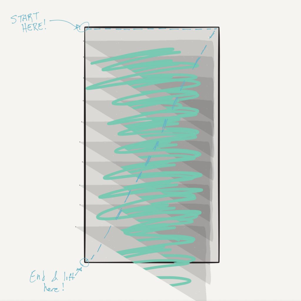
2. While still holding down, cut diagonally to the corner parallel to the corner at which you started. By keeping your stylus/finger down, you can fine tune your ending point.
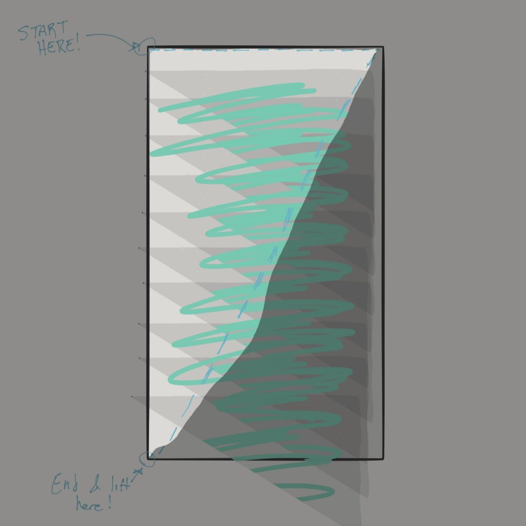
3. Now end your cut by lifting up. Ta-da! Paper automatically completed the cut’s triangular contour for you, creating a straight line from your ending point to your starting point!
4. To remove this element, drag and swipe the highlighted segment off screen.
5. Repeat these steps for the remaining triangular segment of the screen, again starting from one corner, tracing the shortest line, and diagonally finishing the cut at a parallel-to-origin point.
Using this trick to continue cleaning the exterior we get….
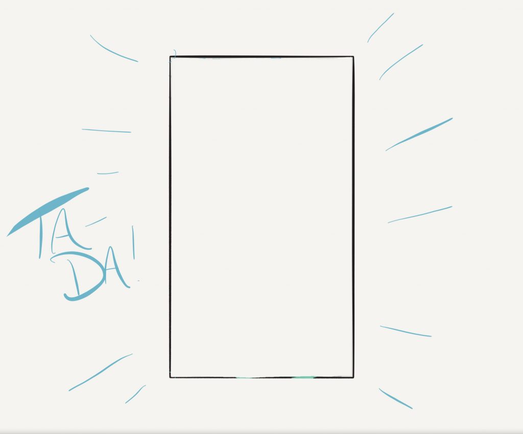
Almost perfect! Once you get the hang of this trick, it becomes very easy to instantly create clean cuts with only a tiny bit of precision required. I’m amazed how long it took me to figure out this (admittedly) easy trick but since learning it I find cutting and manipulating elements easier than ever!
Trick 4: Do more than finger paint
This is a quick but powerful trick that is oddly hidden away in the settings menu without much fanfare — but by far one of my favorites in practice.
If you use an Apple Pencil or Pencil by FiftyThree stylus, you can set your fingers to cut, draw, or blend (or do nothing at all) regardless of the tool currently assigned to your stylus. This makes multitasking easier than ever — without the need to continuously switch common tools.
Steps:
1. Start by navigating to your settings. This is accomplished by opening the grids side panel, clicking on your avatar on the top left, and selecting “Settings.”
2. Select “App Settings” and choose “Apple Pencil” (or whichever supported stylus you’re rocking) from the menu.
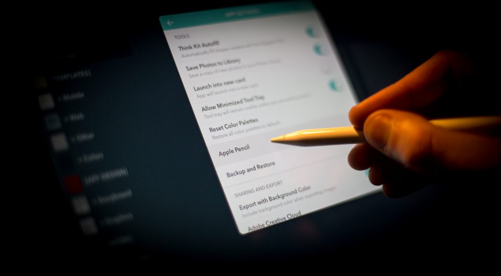
3. You’ll see a settings screen with four options: Blend, Cut, Draw, Nothing. Select the option that makes the most sense to your workflow.
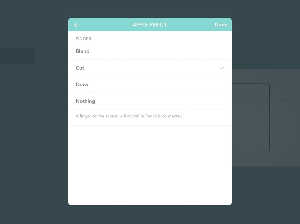
Now you can use your fingers for blending — an advance technique that has some beautiful effects, cutting — very powerful especially when used in conjunction with trick 3, drawing — the default, or nothing at all!
After experimenting with each, I’ve found that I most prefer having my finger work as scissors (“cut”) so that I can quickly snip and move/delete/duplicate UI elements and notes without needing to bring up the tool panel to switch tools.
Give each option a try and see which works best for you!
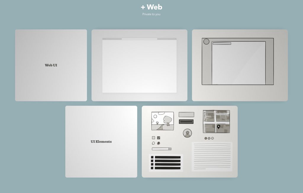
Trick 5: Templates
With the introduction of the “Start a Project” templates, it is now easier than ever to skip blank canvas paralysis and jump right into a new design.
Wouldn’t it be great though if you could quickly access your favorite templates at any time — both those you’ve created and those from FiftyThree? By creating a grid just for storing templates, you can do just this AND have the added benefit of accessing your favorite Project templates offline.
Steps:
1. Start by creating a new grid and give it a name like “Templates.” (Creative, I know).
2. Add in a few child grids, such as “Web” or “Storyboards.” (Note: See Trick 1 for more info on how to organize and stylize your grids).
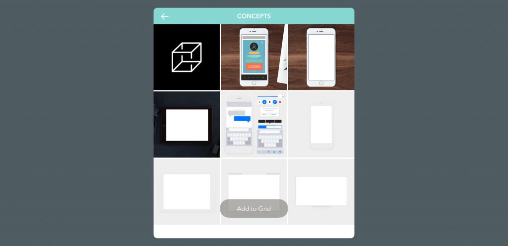
You can now start building your library of templates either by crafting your own or adding in some of the beautiful, pre-made templates available through Paper.
3. To do the later, start by selecting “Grid Settings” from grid overview screen — which can be found by clicking the three dot menu button in the top right — and navigating to “Start a Project.”

4. Browse through the many great options and find the templates you like best. Next, select each template and tap “Add to Grid.”
5. You can continue adding more templates to this grid — hand crafted or sourced from the online library — and play around with organization by creating textual dividers as shown here:
Templates are by far one of the best ways to quickly hit the ground running — especially if you often need to use a base framework for your drawings or prefer a bit of creative inspiration when starting. Certainly beats drawing out the same elements again and again!
Conclusion
Paper by FiftyThree is a great tool and does what it is supposed to very well — so well, in fact, that much of its shortcomings and quirks can be justified as smart “design decisions” that help better focus the user on the task at hand: creating.
By not being too robust, Paper stays true to its name. With these five tricks, however, you can not only boost your productivity but truly make Paper work for you — from multitasking to rapid ideating. In no time, you’ll be a true Paper pro!
Note
Thanks so much for reading this fun list of tricks for up’ing your Paper game! I hope you found these tricks useful and learned something new and interesting!
Have any tips and tricks you use for Paper or similar apps? Be sure to comment and let me know!