

A challenge in Creative Direction: uniting the exploratory nature of TED talks with the academic spirit of Cornell University to amplify and inspire interdisciplinary voices near and far around the Ithaca, NY campus.
Widely known for the innate ability to connect and inspire, TED talks are one of the most popular forums for the shaping, illuminating, and transposing of ideas from community to community in a way achieved by few other mediums. With these core values in mind, a mission arose to organize, curate, and produce a TEDx event at Cornell University - a first of its kind for a school known well for a spirit defined by diverse studies, geographies, and students.
Brought on as the Creative Director, my responsibilities were threefold: 1. assemble an able team of designers (web and graphic), developers, and photographers; 2. identify and align around a stylistic voice representative of our spirit and theme; and 3. lead and help produce design and photographic content at a standard worthy of the Cornell and TED marks.
Fortunately, with so many incredible minds organizing, assisting, and presenting, these tasks were completed with ease and the production went off without a hitch. From building a team to photographing the production, every stage of the event was as immeasurably rewarding as it was memorable.
Organization of TEDx event at Cornell University.
2015


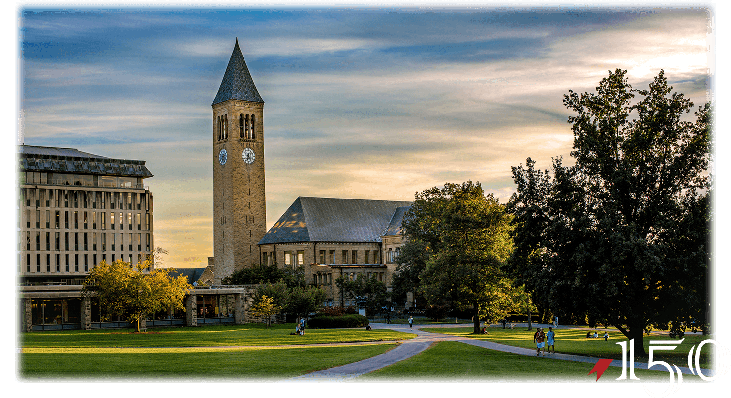
As with most great ideas, the idea to bring TEDx to Cornell University originated in a roundabout fashion: how do we celebrate best the spirit, character, and populous of a university marking its charter's 150th year? Early ideas ranged from a syndicated magazine to a lecture series - soon evolving into the proposal for a student-organized TEDx event.
With the gears in motion and approval received, a core team of organizers formed and I was soon brought on to help lead and guide as Creative Director. Over the following weeks our team of five would expand to nearly thirty-five in total - strategists, stage designers, production assistants, content generators, and more.
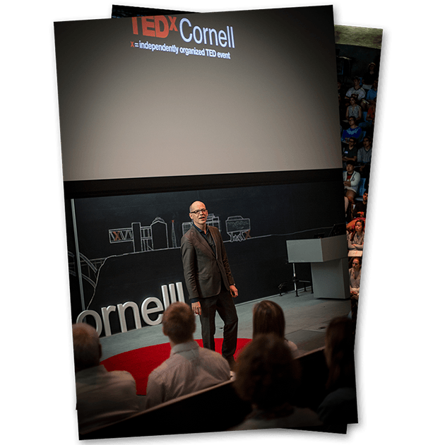
Seven short months later, on the evening of on May 1, 2015, TEDxCornell brought together nine incredibly distinguished speakers and an audience of over 200 - the two of which consisted of students, alumni, faculty, and other thought leaders - for an evening of discussion and entertainment. The event was memorable not only for the talks and attendees, but for the incredible collaborative work that made every moment of the occasion possible: from lighting and stage design to PR and communications.
Aligning a dispersed team of graphic designers, web developers, social media strategists, advertisers, communication liaisons - all of whom were students volunteering what little free time they had - was my first priority as I began the role of Creative Director.
While the organization team continued recruiting new talent, I set to work on a styling guide which would help set the tone, styling, and identity for external-facing components of the event.
Drawing inspiration from the theme of “Traditions & Transitions,” I worked closely with university communication leads, student body members, and visionary faculty to establish a clear understanding of the unique tonal characteristics, beliefs, hopes, and fears encompassing the past, present, and future of the Ithaca, NY based university.
With these key understandings in place, I drew from the official styling guidelines of Cornell University (particularly ones from the 1970s) and those of TEDx to define and articulate an actionable guide for creating, presenting, and sharing visual and textual content. This guide included guidelines for language, fonts, colors, imagery, graphics, and beyond - acting as a cornerstone for all published and shared content.
As the team grew, so did the guide, evolving incrementally over the incredible seven month journey to the production. The end result was an integral catalyst for streamlining the design and communications process and fundamental to the alignment of a broader organizational body on a singular voice and vision on all fronts.
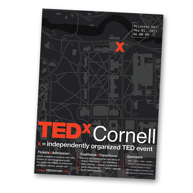
With the style guide in place and a team of three designers - two graphic, one web - under my lead, the design team set out to create a strong visual presence online and on campus. Despite the small team size, we worked rapidly to produce a wide body of content including event posters, web content, programme booklets, apparel, flyers, banners, and more.
All the while, the team and I worked closely with the TEDxCornell Communications and Advertising/Marketing teams to develop key assets for distribution across a range of audiences and mediums. Our work included grassroots advertising efforts, social media content, letterheads, invitations, and team profiles. Evoking a rouge grassroots and counterculture feel to our advertising and identity - especially early on - was of key importance to our strategy to gain incredible traction and excitement while working on an admittedly shoestring budget.
One of my favorite initiatives involved "blanketing" the school in Xs far before our announcement of the event. From unpeeled stickers left in popular cafés to cutouts smartly placed on event boards and in newspapers, we used nondestructive tactics to ensure that just about everyone on campus was wondering what the Xs represented. In the weeks preceding to our announcement of the event, we transitioned from simple X shapes to Xs containing clues towards the announcement such as the event date and link to our website with a countdown.
With the final reveal - distributed by press release, student newspaper, social media, and website - the campus response was immediate and unified in excitement. The team nearly doubled and our marketing efforts turned toward the call for (and then announcement) of speakers and finally ticket sales.
Through the design and advertising strategy of the event, we curated a feeling that this was not cut from the standard cloth of other university events nor was it a few hours of lectures. We built the identity from the ground up as being something elusive, transient, and special beyond words and symbolic only through a single concept: an X - a cross between traditions and transitions, academics and passions, Cornell and the world beyond.
In the weeks leading up to the event, I shifted my creative focus from graphic design and advertising to media and web. While my team of designers worked tirelessly on set design and social media content, I set off to assist with ramping up our marketing and strategy for ticket sales online, working closely with our web team.
Congruently, I helped build a team of staff photographers and videographers to cover the event. Capturing this night - the excitement, organizers, helpers, attendees, and speakers - was an incredible way to cap all of the work, energy, and support that went into creating such a memorable final product.
At the end of the night, after the attendees departed, speakers mingled then dissipated, and space was cleaned, the team and I were left with a feeling that could not be beat: seven months of balancing organizational work with coursework contributed to a truly spectacular outcome.
Through the joint efforts of all those involved, we were able to create a night unlike other - one which honored well the “Traditions & Transitions” of Cornell while reflecting the unmistakable academic spirit characteristic of TED talks and university campuses worldwide.
